

Typography book
Introduction
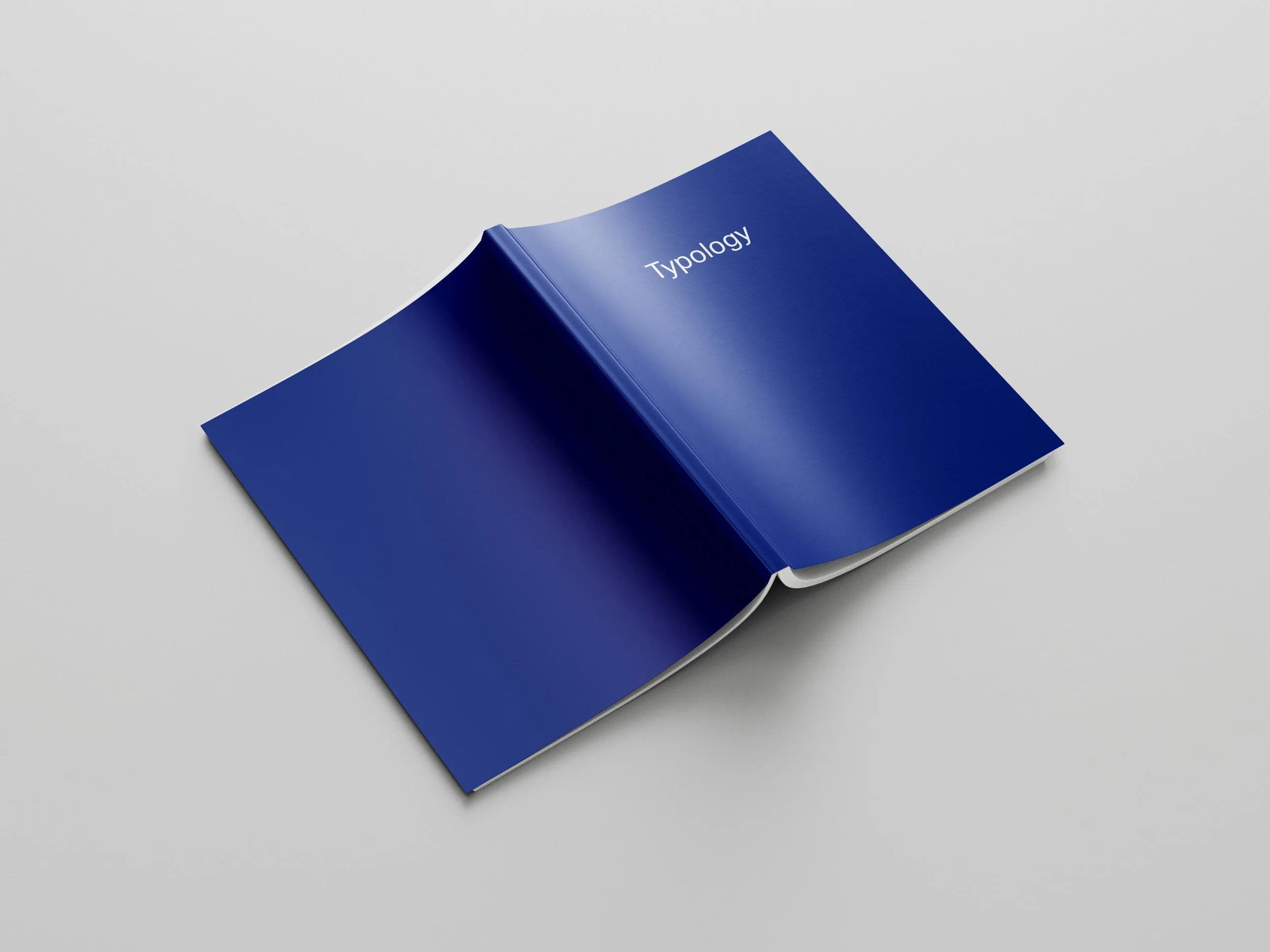
For this project I set out to create a typography book while exploring various typefaces. My goal was to deepen my understanding of different font styles, their rich histories, and intricate anatomical features such as x-height and ascender height. This project stemmed from a university-based assignment, aiming to enhance my understanding of InDesign and the history of typefaces.
Achievements
The book I created offers an in-depth exploration of various typefaces, providing readers with a comprehensive understanding of typography. Each section I crafted delves into different font styles, covering their historical context and anatomical characteristics. Spanning 43 pages, my book showcases over 400 fonts, offering a broad overview of typographic diversity that I'm truly proud of.

Design
I decided to incorporate Looney Tunes characters to showcase the fonts, using quotes from these beloved characters as examples. This approach allowed me to add an element of fun and engagement to the learning process. Interestingly, I chose to set the text in blue rather than black, based on studies suggesting improved readability with this colour choice.
One of my favourite examples of how I used the fonts with the quotes is Yosemite Sam paired with the blackletter font Fette Fraktur LT Std. I felt this combination gave an old-timey feel that complements his cowboy character perfectly. One of the quotes I used was: "Ya better say yer prayers, ya flea-bitten varmint, I'm a-gonna blow ya to smithereenies!" This demonstrates how I reflected character personalities through font choices.


Reflection
This project has been a great exercise in developing my skills for formatting large amounts of text effectively. It also presented an opportunity for personal growth, encouraging me to push beyond my comfort zone and tackle challenging aspects of the project. The experience has enhanced my understanding of typography and book design while also improving my ability to manage complex design tasks.
The biggest challenge I faced when building out this book was ensuring all elements fit cohesively while maintaining a consistent pattern. It was crucial for me to avoid presenting every example in a similar manner to prevent the layout from looking disjointed. This project provided me with a significant learning experience in the importance of using master pages and grids, skills that I'm confident will prove valuable in my future design projects. I'm excited with the outcome and excited to apply these newfound skills to my upcoming work.