Flora at Kopua
Introduction
I explored this exciting journey to craft a distinctive brand identity for Flora at Kopua, a local florist. My mission was to create a versatile logo that could bloom into easily identifiable patterns, perfectly capturing the essence of this flourishing business. I aimed to intertwine the delicate beauty of flowers with a sense of professionalism and trustworthiness.
Results
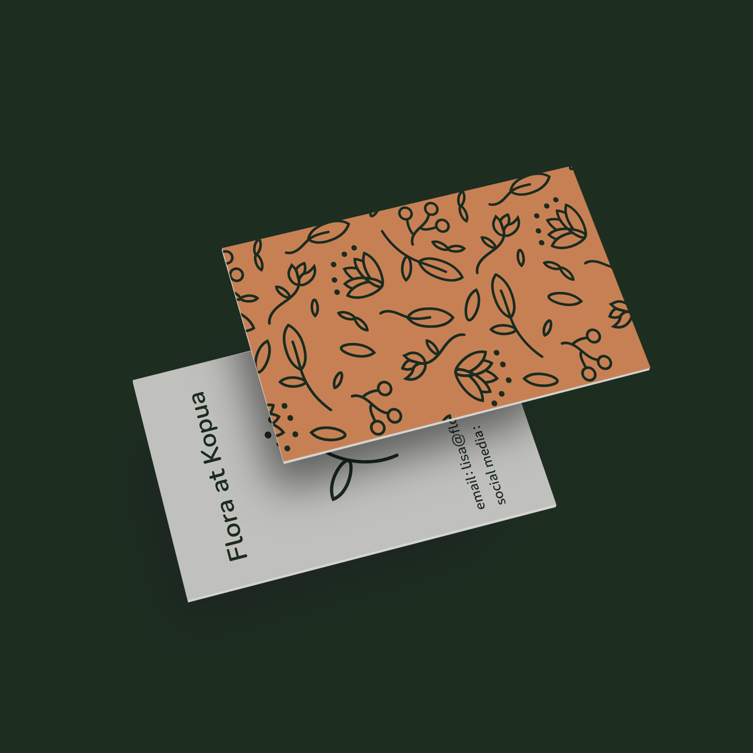
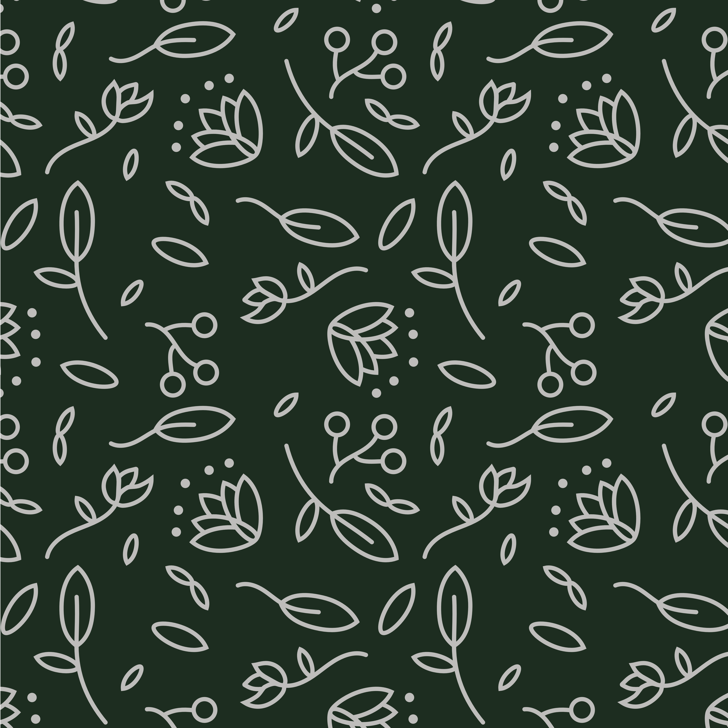
I'm excited to have cultivated a scalable logo system that effortlessly adapts from smaller social media icons to grand banners marks. This flexible approach allowed me to sow additional assets, including patterns that can be used creatively - from wrapping bouquets to adorning business cards.
My logo system features:
A compact version that's perfect for social media profiles and small-scale applications
An expanded version that truly shines on larger print materials and signage
Beautifully derived patterns for packaging, stationery, and other branded materials

Design
I crafted the design assets to embody the delicate nature of flowers while showcasing the diverse range of flora in the florist's arrangements. My key design elements include:
Organic, flowing lines that dance like natural forms of flowers and foliage
A vibrant colour palette inspired by the florist's most beloved blooms
Typography that gracefully balances elegance with readability
Adaptable elements that can grow and evolve alongside the brand
My overall design aesthetic strikes a harmonious balance between fresh, contemporary vibrancy and timeless elegance, sure to resonate with Flora at Kopua's cherished clientele.


Reflection
I'm absolutely delighted with the final brand identity I created for Flora at Kopua. It beautifully captures the essence of the business, weaving together organic, flowing elements with a sophisticated and trustworthy aesthetic. The versatility of the logo system and its ability to generate cohesive patterns is a testament to the project's resounding success in meeting and exceeding my initial objectives.
Key triumphs:
Cultivated a unique, instantly recognisable brand identity
Nurtured a flexible logo system adaptable to various applications
Designed patterns that beautifully extend the brand's visual language
Planted strong roots for future brand growth and development
This project not only met my client's needs but also pushed my creative boundaries, resulting in a brand identity that truly reflects the artistry and professionalism of Flora at Kopua. I'm incredibly proud of what I've achieved and excited to see how this blossoming brand will continue to grow and flourish.